Essay lead management
Lead Generation Landing Page Design for B2B Conversion
Focus message match and offer fit before redesigning buttons.
Traffic arrives on the page. Visitors scroll. Nobody converts. The team staring at the dashboard has no idea whether the culprit is the offer, the form, the copy, or the wrong people landing on the page. That diagnostic fog is where most landing page work actually starts, and it is also where most teams misdiagnose the problem. They assume it is a design issue, so they swap a button color or rewrite a headline, when the real issue is that the page was built as a brochure for one imaginary reader instead of a decision tool for a room full of real ones.
B2B buying is a committee sport. Nobody on that committee is spending their own money, and everybody on it answers to someone else if the vendor choice goes badly. A landing page that ignores that psychology, no matter how clean it looks, is asking a cautious group of people to take a career risk based on surface-level design choices. The page has to answer questions about credibility and fit before it ever gets to features, which polish alone cannot fix.
A 2026 study of 2,000 tested pages found webinar registration pages converting far higher than B2B SaaS demo pages. That matters less as a trivia fact and more as a warning: judge your SaaS demo page against a webinar benchmark and you will either celebrate numbers that are not good enough or burn a redesign budget chasing a target that was never realistic for your category.
Conversion Benchmarks by Offer Type and Source
A single average conversion rate across all of B2B is close to useless. The number that actually helps a team is the benchmark for their specific offer type, paired with the traffic source bringing people in, because those two variables explain more of the gap between a struggling page and a thriving one than any button test ever will.
Traffic source alone can flip the story. An email subscriber already trusts the sender, while someone scrolling a feed is being interrupted mid-scroll with zero prior relationship. A social-sourced landing page that underperforms against an email-sourced one may be doing exactly what it should.
Offer category also drives conversion rates sharply. B2B SaaS has a 3.8% median conversion rate, and B2B agency and services work runs close behind at 3.6%. The honest target for most teams is their own category's top quartile, not the median and not the rare elite-tier page pulling 20% or more, since reaching median is a tuning problem while reaching elite status usually requires a fundamentally different offer.
Measurement discipline matters as much as the benchmark itself. Calculating conversion rate correctly for B2B means tracking by cohort: leads created in a given window get matched against the closed outcomes from that same window, rather than blending leads from one period with closed deals from another. Mixing periods inflates the reported number and hides real performance; a team can look like it is winning while the pipeline quietly starves.
Ad-to-Page Message Match Drives Conversions
Message match is the alignment between what an ad promised and what the landing page delivers in the first few seconds after the click. It is the precondition that decides whether every other tactic on this page gets a chance to work. A beautifully designed page with excellent form logic and a fast load time still fails if the visitor's first reaction is "wait, is this the right place?"
B2B visitors arrive carrying specific context. Someone clicking a paid search ad aimed at a particular pain point expects to see that pain point addressed immediately. Sending those visitors to a one-size-fits-all demo page creates an intent mismatch that kills the conversion before the page has communicated a single useful thing.
Tight message match pays twice. It lifts conversion rate on the page itself, and for paid search specifically, it also improves Quality Score, which keeps cost-per-click under control. Better conversions and cheaper clicks at the same time is why message match ranks as the single highest-leverage fix available to a paid-search team, ahead of anything involving layout or color.
Every distinct campaign intent, including brand searches, competitor comparisons, specific product features, and general problem-awareness content, deserves its own landing page built around that intent, rather than one shared page trying to serve all of them. Sending competitor-comparison traffic to the generic homepage is a reliable way to waste that click.
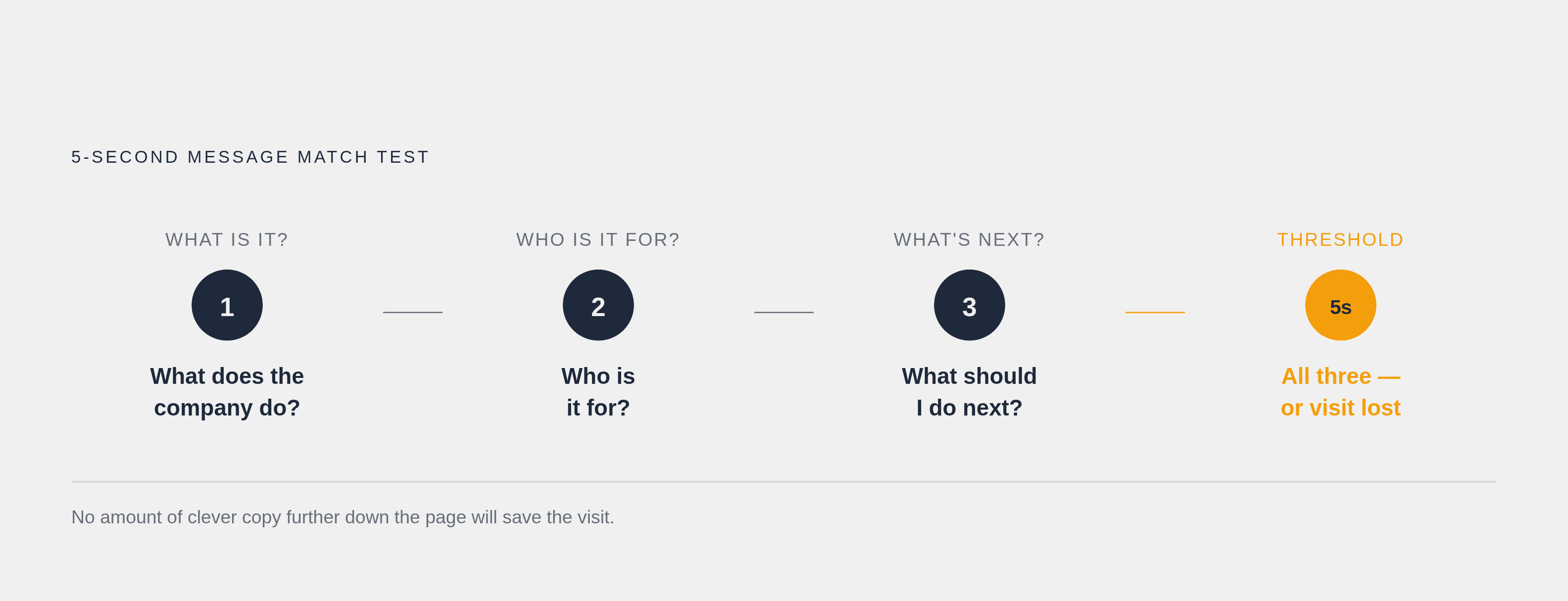
There is a simple test for whether message match is working: can a visitor answer, within 5 seconds of landing, what the company does, who it is for, and what to do next? If any of those three questions goes unanswered, no amount of clever copy further down the page will save the visit. A hero section that reads as a vague brand tagline could describe a dozen competitors equally well. Rewriting it to lift language directly from the ad that brought the visitor there, trading the vague tagline for a specific outcome tied to a named industry vertical, is usually the fastest and highest-impact change available in an audit, ahead of form tweaks, ahead of color tests, ahead of nearly everything else.
Above-the-Fold Design: Show Less, Convert More
The space above the fold has exactly one job: confirm the visitor is in the right place and make the next step obvious. Most B2B pages load that space with a full navigation bar, a rotating carousel, three competing calls to action, and a mission statement, all of which give a visitor too many directions before they have taken the one action the page exists for.
Full site navigation is the clearest offender. A header stocked with links to the blog, the careers page, the pricing page, and five product pages gives a visitor permission to wander off before they have done the one thing the page exists for. Pages built around a single focus convert better than pages trying to serve several goals at once, and no-navigation pages tend to outperform full-navigation pages, especially with traffic that is already mid-funnel or further along. On a dedicated landing page built to convert one specific type of visitor, a full nav bar is a row of exit doors.
Enterprise sales complicates the picture slightly. A minimal anchored header with just a logo and one visible CTA splits the difference: it preserves enough orientation to feel legitimate without reopening those exits. The goal is removing every path that is not the one path that matters.
That same logic governs how many calls to action belong above the fold. The answer is one. Each additional option adds a decision the visitor has to make before they can take the action the page actually wants. A visitor asked to choose between "Book a demo," "Download the guide," and "Watch the video" often resolves that friction by choosing none of them.
A 2026 study of 2,000 tested pages found webinar registration pages converting far higher than B2B SaaS demo pages.
Page Speed Is a Direct Conversion Variable
None of the above-the-fold architecture matters if the visitor never actually sees it load. Page speed belongs on the strategy side of the ledger, not filed away as an engineering concern to revisit someday, because it functions as a direct conversion variable in its own right.
For paid traffic, slow load times create two costs. Slow pages degrade Quality Score, which pushes cost-per-click up before a single conversion has been counted. The damage appears on the media bill first and in the conversion report second, so a team only watching conversion rate can miss the fact that they are also paying more for every click that arrives.
The benchmark to anchor to is Largest Contentful Paint, or LCP, at 2.5 seconds. Speed is a front-line conversion lever sitting right next to message match and form design, not a secondary polish item reserved for whatever time is left at the end of a project.
Form Design: Stop Optimizing for the Wrong Thing
The form is where every structural decision made so far cashes out into an actual lead, and it is also where B2B teams most reliably optimize for the wrong thing. The common wisdom says fewer fields always win, and the data backs that up on its face: three-field forms convert meaningfully better than nine-field forms, which justifies stripping every non-essential field out of the initial capture.
But that rule has a real limit. High-value B2B offerings can justify longer forms, because a longer form filters for buyers serious enough to complete it. The right length depends on what the offer is and who the form needs to filter for.
Progressive profiling resolves a good chunk of that tension. Capture the bare minimum at first contact, then collect qualification details later through follow-up interactions, email replies, or a second-step form. That approach keeps lead quality intact without front-loading friction that turns away a genuine buyer on the first visit. ZoomInfo's FormComplete shows one concrete version of this in practice: it auto-fills form fields from ZoomInfo's own database, and in Smartsheet's case, that tool produced a meaningful increase in form fill rates, since the visitor experiences a short, easy form while the sales team still receives the full routing data it needs on the back end.
Multi-step forms work on a similar principle. Breaking a form into stages makes the first step feel low-commitment, which separates the initial expression of interest from the heavier ask of full qualification details. A visitor who has already said yes once is far more likely to keep going than one facing nine fields in a single block. Small reassurances near the submit button do similar work at the exact moment hesitation peaks: a line reading "No credit card required" or "Takes 2 minutes" lowers the perceived cost of clicking right when the visitor is deciding.
Lead quality is the deeper issue most conversion rate optimization debates skip. Lead quality gets treated as a property of a single contact: is this one person senior enough, qualified enough, real enough? But the actual buying group in B2B is a committee, not a single person. Optimizing form length in isolation, without asking who the form needs to identify across an entire buying group, is solving a smaller problem than the one actually sitting in front of the team.
CTA Copy That Reduces Risk and Builds Trust
The CTA button is the last thing a visitor reads before they decide, which makes its wording function less like a direction and more like a final credibility check. Generic labels like "Submit" or "Send" frame the click as handing something over with nothing promised in return. Benefit-oriented alternatives such as "Get my free audit" or "Book a 20-minute demo" name the specific thing the visitor gets back, turning the click into a stated exchange. That rewrite only pays off if there is a single CTA for it to concentrate on. Single-CTA pages convert at a higher rate than pages with several competing options, so strong button copy is wasted if it is competing with three other buttons for the same click.
For a B2B audience specifically, CTA language can do one more job: lowering the perceived risk of the click itself. Phrases like "No commitment," "Cancel anytime," or "See it before you talk to sales" speak directly to a buyer who is deciding on behalf of a budget and a manager. That accountability makes risk disproportionately high for someone answerable to a committee, and button language that acknowledges it removes one more reason to hesitate.
Social Proof: Specificity and Placement Win
Social proof earns its keep on a B2B landing page only under two conditions: it has to be specific enough that a skeptical reader could go verify it, and it has to sit close enough to the point of decision to catch hesitation right as it happens. A testimonial floating in a footer nobody scrolls to is decoration. A named customer, a specific result, and a real title placed right next to the button the visitor is deciding whether to click is evidence.
Vague praise does almost nothing for a buyer who is wired to doubt vendor claims. A quote naming a real person, a real company, and a measurable outcome gives a buying committee something they can bring back to their own internal conversation and defend. The strongest, most specific proof belongs exactly where the buyer is weighing whether to click, where it turns doubt into a decision.
Notes
- Landing Page Conversion Rates: 2026 Benchmarks and 8 Tactics
Provided conversion rate benchmarks by offer type, form field data, and tactical guidance on CTAs, social proof, and message match that underpin multiple sections of the article.
- Lead Generation Landing Pages: 2026 Conversion Guide
Contributed structural guidance on lead generation landing page design, including form design principles, progressive profiling, and above-the-fold architecture discussed throughout the article.